

Community levels and Community transmission
The CDC and its absurd games

A while ago I was pointing out how the CDC was pushing its ‘Community levels’ metrics to scare institutions into implementing new mandates based upon its color-coded map based on data in their systems that was completely unrelated to data on the ground.
The good news was that that pressure didn’t work. Some public and private institutions hooked their mandates to that county color scheme at first, but in the end most have since stepped away from blindly following that arbitrary ‘guidance’, leading to a rapid dropping of mandates followed by a rapid lowering of alert levels across the country. See below for a comparison of August 5th and September 29th in Ohio.
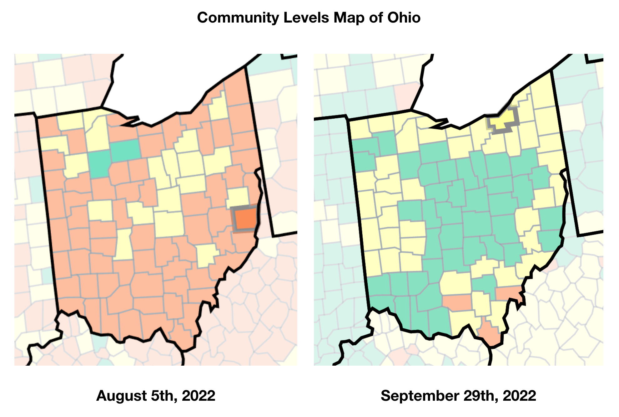
August 5th was when many institutions and localities had begun to implement the ‘following the CDC guidance’ mantra, but as the colors arbitrarily bounced back and forth from week to week, many of those institutions dropped it. The last major hold out in Ohio, Ohio University, dropped its mask mandate on September 2nd. Since then, things have only improved in the CDC’s community levels.
Huzzah! Things are looking good!
On top of this, the CDC announced last week that they were walking back universal masking in healthcare settings in certain situations. Even better! So what are those specific situations?

So we’re back to the CDC’s Map of Fear again. Sigh. Ok, well, at least the Community Levels map is almost entirely green throughout the US, so most places should be good, right?
Well, no…. Because healthcare settings do not use the Community Levels map, they use the Community Transmission map. They are quite explicit on the map page about the different usages, as seen below:

Well, ok — it can’t be that different, right? Right…..?

So here we are, the perfect encapsulation of just how stupid the CDC’s whole system is. ‘Community Levels’ is displaying nearly the entire country as a happy, bright green ‘low’, while at the exact same time, the ‘Transmission Levels’, which is to be used only by healthcare facilities, is almost all ‘We’re all going to die’ red.
To increase the level of ridiculousness here, the ‘community levels’ explicitly takes into account healthcare usage, specifically new COVID admissions (even if those numbers are fraudulent) and percentage of staffed beds occupied by COVID-positive patients. The ‘community levels’ should directly take into account exactly what the burden on healthcare facilities is, while the ‘transmission levels’ are based on the ever-nebulous ‘cases’ and percent positivity on NAAT (PCR) tests.
Again, the map reflecting at least some aspect of the burden on healthcare resources is not to be used by healthcare facilities. Instead, healthcare facilities should base their fear levels on vague ‘cases’ and test positivity rate.
Let’s take a quick look at just how ridiculous those two metrics are:

As you can see in the figure above, large swathes of the country have absolutely no positivity data. That’s right. In those regions, the only metric affecting the ‘transmission level’ is the most arbitrary metric of all: cases. Any kind of ‘case’ counts. PCR test, antigen, symptom-based diagnoses, or positive tests with no symptoms at all. All just added up and used to paint the transmission map red.
The positivity metric is also arbitrary. Below, see a close up of just Ohio on positivity rate and the raw number of tests given:

Note the obvious. In general, counties with fewer tests being given tend to have a higher positivity rate. Those using more tests have a lower positivity rate. Regions with high densities of CLIA-certified labs, like NE Ohio, have far more NAAT tests being used, because that’s what’s easily available. In regions where there isn’t that overabundance, fewer tests are being used, and are more likely to have a higher probability of positivity on a NAAT test (negative antigen and rapid tests are not counted).
Then you have the problem that each test given does not necessarily represent separate individuals. If a long term care facility requires a negative test before reentry into the facility after a hospitalization, for instance, you can have a series of positive test results in a row, each one increasing the positivity rate. It isn’t indicating more cases or transmission necessarily, just the testing strategy itself.
Then you bring in variations in the quality control on the tests being used, which manufacturer’s tests (as they do vary in specificity and sensitivity), and you are, again, left with useless numbers.
And yet this is exactly what healthcare facilities are using to defend continued masking.
My daughter had an appointment with a hematologist (Cleveland Clinic) at the end of August, and as soon as the doctor came into the exam room, he asked if he could take his mask off and said we could too if we were comfortable with that. Cleveland Clinic! I was pleasantly shocked.
And here I am in administration at an outpatient facility (audiology dept no less) and still choking on mask fuzz every day for literally no reason at all. It’s insane.