

Where is the CDC getting their data?

I was asked by a reader to look at another county’s data as his employer was looking into reimplementing a mask mandate based on the CDC’s color scheme and create a similar breakdown as I had for Butler County. I’ve seen a lot of data nonsense over the last 2.5 years, but this one truly takes the cake.
The county I was asked to look at was Clark County, Ohio. So let’s walk through this, starting with what the CDC says is going on:
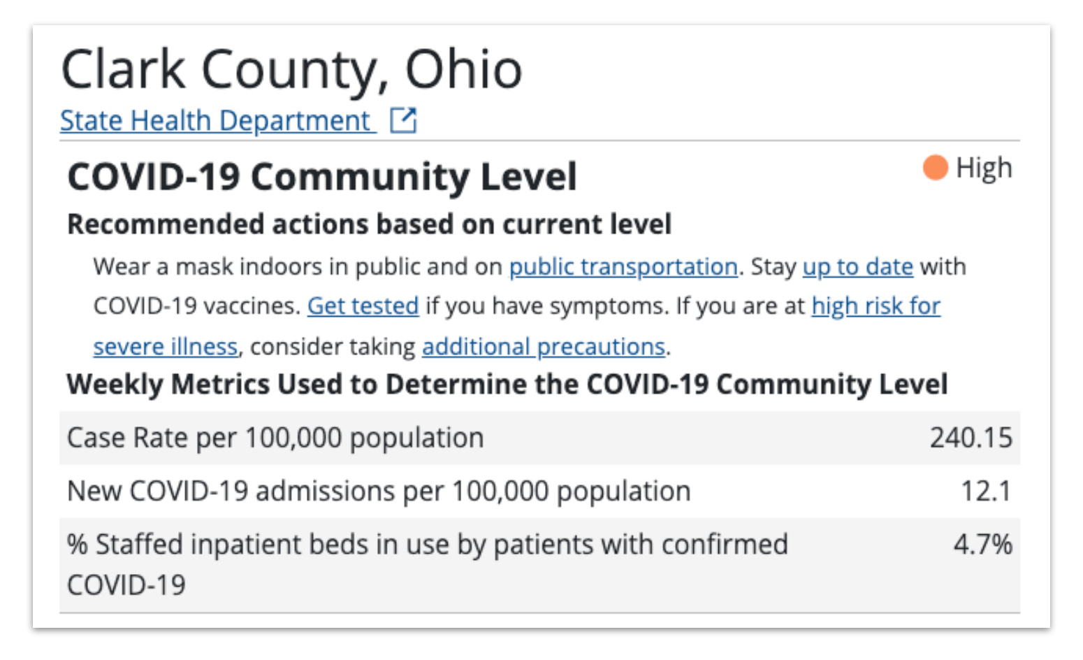
Seems simple enough, doesn’t it? It has over 200 cases/100,000 population, and 12.1 new COVID-19 admissions per 100,000 over 7 days, putting it at a ‘high’ level.
But a funny thing happened when I went to look at the data more closely.
Clark County had had ONE (maybe) hospitalization within the 7 days of interest. See below:

For completeness sake, please see the full list of all hospitalizations in Clark County going back to the beginning of May listed here:

That’s all of them. For more than 2.5 months. In a county with ~134,000 residents. Even more ridiculous, 4 of these ‘COVID’ hospitalizations had ‘onset’ occurring after admission, with another 5 on date of admission. There is and has been no ‘crisis’ in Clark County for a very very long time.
But the CDC is claiming that over those 7 days there were 12.1 new admissions, which comes out to 16 new admissions. The state records just 1.
Where are these admissions coming from?!
I’m thinking to myself I must be missing something. And, indeed, I am. See, despite Ohio having county by county data, the CDC has a ‘better’ way to count, by creating a ‘Health Service Area’ which seems to have very little meaning to it. Some areas include 6 counties, some just one. Rural areas can stand alone or be lumped in with major cities, no rhyme or reason to it at all (this is a discussion for another day).
Sigh.
Ok, CDC, I’ll look up what other counties are lumped in with Clark. What do I find? Just Champaign County, a rural county just to its north. So what hospitalizations occurred in Champaign during the dates in question?

Um, what? So. Now we have 3 total new admissions to the hospital. None of which were FOR COVID!
Together, Champaign and Clark Counties have a population of 173,000. 3 new admissions gives us a rate of 1.7 new admissions per 100,000 population.
Where is the CDC getting their numbers???
I must be missing something, right??
So I dig deeper, and I find their list of sources. What do they list as the data source for Ohio?
https://coronavirus.ohio.gov/wps/portal/gov/covid-19/home
The exact same data source I am using.
But somehow, the CDC is counting non-existent admissions. And from the non-existent admissions they are counting, they are magicking a ‘wave’ of COVID across the US, causing schools, businesses, counties, everything to start re-instituting more mandates again based on nothing but pure fantasy.
This is not even a question of from COVID or with COVID. These admissions simply do not exist AT ALL.
And just as icing to this whole sordid mess, the CDC has a downloadable csv file available here, listing all of the counties and their data, ‘updated’ weekly. That’s convenient, isn’t it?
Except that it has not been updated since March.
Every week it says it’s updated, the one currently up says it was last updated 7/21/22. But one glance at the actual file shows it isn’t true.
All the numbers are fake, truly fake, and there’s no way to track the fakery.
And yet this is what the renewed panic and wave of mandates is based on.
I work for a private company that follows the advice of Franklin County public health and I found the data most interesting. There is zero justification for even suggesting masks much less requiring them. Even more interesting is the fact that the city of Columbus and City of Worthington are not included in Franklin county numbers. Somehow I was not aware of that until yesterday I don’t know how I got through the 2 1/2 years of this BS without knowing that
It's been obvious to me from the beginning that the CDC has been lying and is a corrupt organization hell bent on keeping up the ruse of a pandemic. You've shown us even more proof. I wish there were a way to prosecute and jail these people. Too many listen and believe them, at their peril.