

Miami University
A closer look at the COVID-19 data from Butler County that has led to the threatened return of more masking

A couple days ago I posted about the absurdity of the data underlying the COVID ‘wave’ sweeping Ohio and causing county Public Health departments to reissue mask advisories and businesses and other institutions to reimplement mandates. You can read more about the whole state’s data here.
Today, I’m going to drill down on one specific county — Butler County, home of Miami University.
I’ve been told they’re right back at it again with a return of mask mandates. So how about we take a nice, close look at what the data is that is supposedly driving this ‘evidence based’ decision, maybe even give those administrators a little help with understanding just how flimsy this is and teach them to look for themselves and not mindlessly follow a fatally flawed system.
First, let’s take a look at this week’s top line data from the CDC’s COVID data tracker website below.

I have boxed in the metrics leading to the ‘High’ level determination.
Below, find the CDC’s table to see how the numbers combine to reach that designation (Butler County’s numbers place it where the red box is).
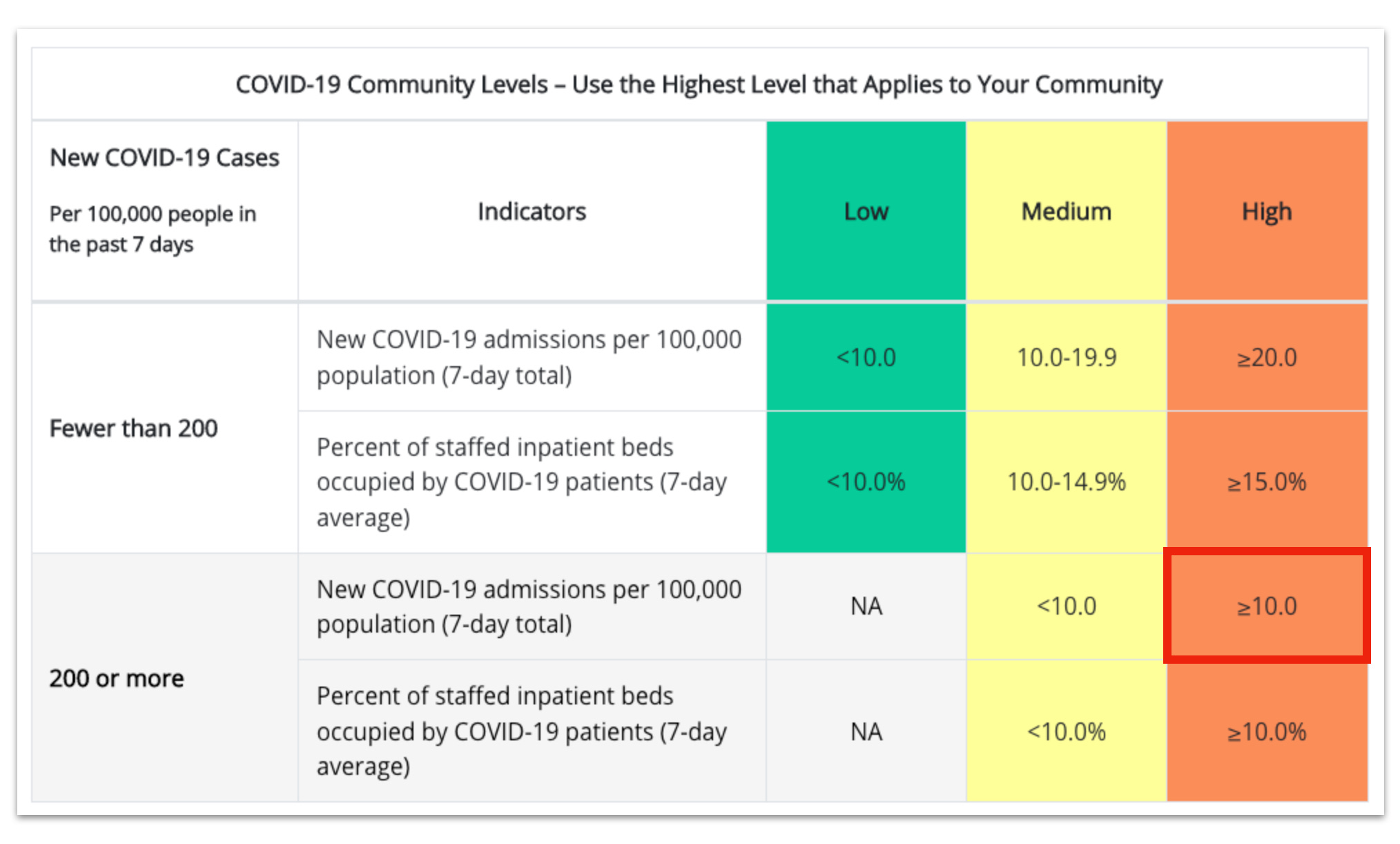
Already, we can see that Butler County’s data is just barely squeaking over the line for both ‘cases’ and new hospital admissions, and as we saw with the whole state of Ohio’s data, not all ‘hospitalizations’ are equal. So let’s take a closer look at Butler County’s ‘COVID-19’ hospitalizations for the pertinent time frame.

There they are.
13 hospital admissions.
That’s it.
For ease of understanding, I have color coded those admissions in terms of feasibility of it being an admission for COVID-19 and not with. Red indicates that they could not have been admitted for COVID-19 disease as ‘onset’ either occurred on date of admission, or, in the case of one 50-59 year old male, after admission to the hospital. These time frames are impossible to be for COVID disease.
The hospitalizations marked in green are those that at least fall in the range of reasonability and the one marked in yellow is still feasible, but is a bit more of a stretch. Of course, I can make no determinations about the two hospitalizations that have an ‘unknown’ date of admission, but they are still doubtless being counted.
Note that the youngest hospitalized patients are 30-39 years old (the two unknowns) and the youngest known admission is 40+.
This is in a county with ~390,000 residents. 5 potential COVID-19 disease admissions over 7 days. That comes out to ~0.001% of the population of Butler County being potentially admitted to the hospital over 7 days.
Absurd.
Now, there is an oddity here and I’m not sure where it’s coming from. The CDC is somehow calculating Butler County as having 11.2 new admissions per 100,000 population. That comes out to ~44 hospitalizations over 7 days. The CDC is supposedly getting their data from the state (which is the data I have posted above). That means the CDC is somehow finding an extra 31 hospital admissions from….somewhere? Something is not right here, but what it is, exactly, I don’t know.
Cases
Now that covers the hospitalization data, so how about that ‘case’ data?
We all already know that ‘cases’ are a mess. Tests will have false positives, at home tests may or may not be reported. And it’s possible that not a single one of those ‘cases’ represents a person who is ill at all, but simply has a positive test result.
With those caveats in place, let’s take a look at the overall cases and hospitalizations for the week broken down by age.

Overall, according to the state’s csv file, there were 735 total ‘cases’ during the CDC window between 7/14-7/20, with over half of those ‘cases’ being in those under 40 The same group of people not being admitted to the hospital. These younger individuals, however, are the most likely ones being serially tested while not experiencing any illness at all, giving us a highly distorted view of disease activity yet again while inflating the ‘cases’ and placing Butler County into a ‘High’ level, with little to no disease activity necessary.
On top of that, we, again have a mismatch between the CDC and Ohio’s data — according to Ohio’s csv, Butler County has only 188 cases/100,000 population, while the CDC calculates from an unknown source that they are at 221.59 cases/100,000. Where do they get that number? I don’t know.
So, for those administrators considering masking these poor students yet again, this is what the reality of the situation is. From the source.
College vaxx and mask mandates need to go. My senior is only looking at colleges now that don’t have those mandates in place. It’s a shame because Miami used to be the top choice. I am in total disbelief that these “highly intelligent” Ph.D administrators can’t comprehend simple research demonstrating the ineffectiveness of these mandates. I have a masters plus 30, did research and graduate statistics courses (from a state U), and can understand it just fine. Where in the heck did these people get their degrees from???? I sure as heck don’t want to send my rising senior there!
This will never stop. Hoping the public schools don’t go there but it’s suspicious. The BC deaths are also sparse and many likely not from
Covid but with Covid and elderly. (I have personal knowledge of one) Thanks for what you do Kathryn.