

No one can seem to find all of the new hospital admissions that the CDC is counting
A study of the Columbus area data

When I think the absurdity must have reached its peak, I dig a little deeper and find even more impressive ridiculousness.
Today, I looked at CDC’s Health Service Area that includes Franklin (Columbus), Delaware, Madison, Fayette and Pickaway Counties. A region that contains over 1.6 million residents and several major hospital systems.
Franklin, Pickaway and Fayette are all orange (high) level while Delaware and Madison are yellow (medium).
What are those colors based on? New hospital admissions, mostly. All 5 counties, according to the CDC have 12.1 hospital admissions per 100k population, putting them all automatically at a ‘medium’ level. Franklin, Fayette and Pickaway all have ‘cases’ that push them to a ‘high’ level. Without the new hospital admission metric, however, those three counties would be yellow, while Delaware and Madison would be very comfortably green.
As a refresher, below is the table showing how the CDC determines the color of a county (supposedly):

So, with all that in mind, let’s take a look at the total hospitalization data for that entire region according to the csv file available at coronavirus.ohio.gov (quick tutorial on exactly where and how to download the file to look for yourself available here).
To make it even easier for those officials to understand just how absurd it all is without having to strain their eyes by reading too much, I even condensed all of it in one simple little graphic (and yes, those are all of the admissions in that time frame, even Delaware’s whopping zero new admissions).
Enjoy:
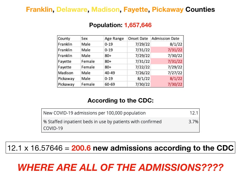
So. Let’s recap. In a region with a population of over 1.6 million people, there were a total of 8 ‘COVID’ admissions. Of course, only 4 of those could even conceivably have the potential to be an admission for COVID, as the other 4 had ‘onset’ on the date of admission.
Meanwhile, the CDC is claiming that there have been 200 new admissions over one week!
Ok then. Let’s double check the potential validity of that, shall we? I went into the Ohio csv file and looked at total admissions for all 5 counties combined. Going all the way back to the beginning of June. There were 173 hospital admissions listed. In total. All 5 counties. Over two full months. But according to the CDC there were 200 in just this last week.
OH REALLY??
Again, the absurdity is extreme and indefensible. And it bears repeating:
ALL counties currently at a ‘high’ level according to the CDC are ‘high’ solely because of this new admissions number.
Read that again and understand it. The CDC is completely fabricating these numbers. No one knows where they are coming from, and they are causing panic and renewed mandates. ‘Cases’ alone can only turn a county yellow, and nowhere has high occupancy rates. After all, why should they have high occupancy rates when I have shown over and over that there are extremely few people going in with ‘COVID’.
As I have stated before — now is the time to fight this while the absurdity is so extreme and there aren’t other respiratory viruses going around to muddy the waters. Engage your local health departments. Ask them where the hospitalizations are. Where is the CDC getting their numbers? If your Health Commissioner is a decent person (and most are, truly), they will ask, and they are, for a certainty, going to find the answers lacking.
Now, when you do push back, these are the likely excuses you will receive (because they are the excuses we have already been given):
“Oh, yes, but there are other counties that are being counted with us. We might have no hospitalizations, so one of those counties must!”
“Oh, yes, we can’t find the hospitalizations either, but sometimes there’s a reporting lag.”
“Well yes, there are no hospitalizations happening here, but we’re testing the wastewater!”
All of which are rather easily debunked by…looking at their own data…
So, for excuse #1, I invite you to check the following list for Ohio counties so you can be clear exactly what other counties are lumped in with your own and check them, just as I have done. Keep in mind that your local health commissioner probably doesn’t even know what other counties are being counted in their region.
The numbers on the left correspond to the HSA number, all counties are Ohio, except those in parentheses which are marked by their corresponding states. This information was extracted from the CDC csv file downloadable here.

For excuse #2, I direct you to the Columbus area example, where two months of hospital admissions don’t reach just one week’s admissions according to the CDC. That is definitely not ‘lag’.
For excuse #3. Oh boy. I’ll be going at this one in the following days. To say that this excuse is literally full of crap is an understatement. I’m looking at you, Ohio University.
So have at it. All but two counties in Ohio are currently yellow or orange. Make your local officials accountable. Make them start asking the CDC questions. If we don’t do it now, they will continue to be able to lie at will.
It's all full of crap! Wastewater measurements need not apply 😉
My sister is double vaxxed, single boosted. She commented on our health board's FB stats this week, appalled that people aren't wearing masks. They've got her brainwashed and terrified.